
A website is hired to do a job
Before we design anything, we ask one question: when someone lands on this page, what do you want them to do next? Call, book, ask for a quote, sign up, request a demo. Everything on the site either helps that happen or gets in the way.
These three projects look nothing alike, because the job was different each time.
The Merchant Way: turn a doubt into a conversation
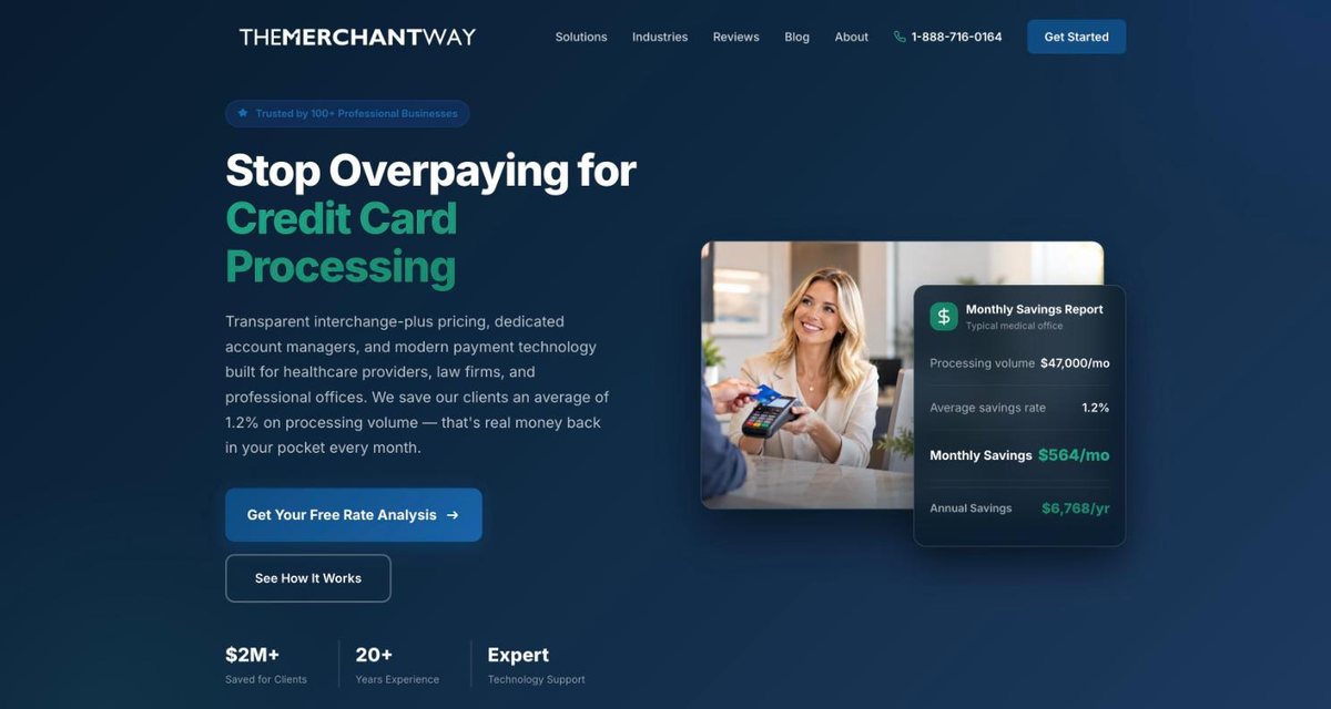
The Merchant Way provides credit card processing for medical practices, law offices, and other professional offices. Its visitors arrive with a nagging doubt: am I paying too much? Most have no easy way to check.
So the site is built around one next step, a free rate analysis. The headline names the problem in plain words. An example savings summary sits beside it so a visitor can picture what they would get back. Below that, the site answers the questions an office manager asks before trusting a new vendor: who else uses this, what do they say, and does it work for a business like mine.
The phone number stays in the header on every page, because some people would rather call than fill in a form.
PhD Source: let people use it, not just read it
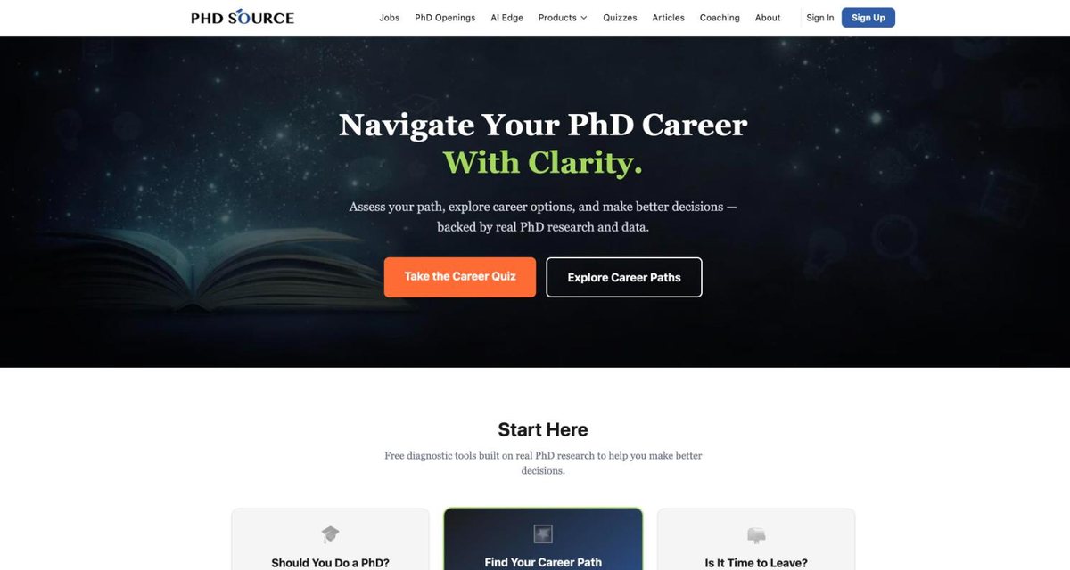
PhD Source helps PhD students and graduates work out their career options. A page of advice would not have been enough, because every visitor is in a different spot.
The site works more like a set of tools. A visitor can take a short quiz about whether a PhD is right for them, map their skills to career paths, or check whether it is time to move on. Around those tools sit job listings, career breakdowns, articles, and accounts people can sign in to.
The home page offers three clear starting points, so a first-time visitor is doing something useful within a minute of arriving.
OncRef: explain something complicated to three audiences
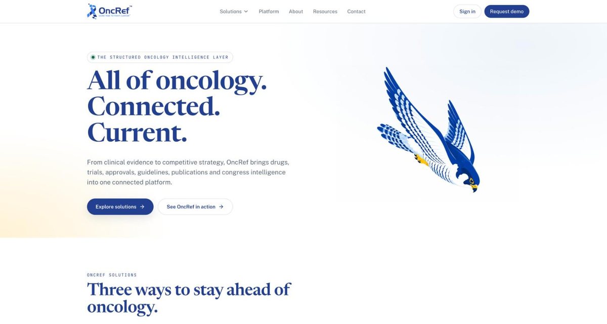
OncRef is a software platform that keeps cancer specialists and industry teams current on drugs, trials, approvals, and guidelines. It is a deep product, and its visitors are busy people from very different jobs.
The site leads with one short line that says what the product is. Then it splits into three paths, one each for clinicians, for people who want regular updates, and for company strategy teams. Each path uses that audience's own words and ends in its own next step, such as requesting access or booking a demo.
The design stays calm and uncluttered on purpose. When the subject is complicated, the page should not be.
What a local business can take from this
You do not need a site as large as any of these. The same three ideas work for a contractor, a salon, or a shop. Pick the one thing you want a visitor to do and make it obvious. Give people something they can use right away, even if it is only a way to book or ask a question. And speak to each kind of customer in their own words.
If you would like a second opinion on your own site, Core Merchants offers a free look at it as part of our business analysis.
Open your own home page and ask what one thing you want a visitor to do next. If it takes more than a few seconds to find, start there.